Advanced Plotting with Matplotlib
In this appendix, we will explore the following advanced visualization topics:
the matplotlib object-oriented interface
creating subplots
using logarithmic scaled axes
adding error bars to data points
adjusting text properties using TeX
The Two Matplotlib Interfaces
Up until this point we have used the Matplotlib interface functions available in the pyplot submodule. This interface was designed to duplicate the user interface in the application MATLAB, a proprietary programming language and programming environment used by many engineers and scientists. The pyplot interface uses a procedural programming model where a program executes using the control structures we introduced earlier: sequential, conditional, and iterative, and where blocks of code that can be reused are packaged in a procedure, which is a function in Python.
The other programming model that can be used with Matplotlib is the Object-Oriented Programming model (OOP). In the OOP model a program is composed of objects that have properties and codes (called methods) that can change properties of the object. At a fundamental level, Python is an object-oriented programming language, although we have not been emphasizing that aspect until now. Even basic data types such integers, floats, and strings are objects in Python.
Two important objects that are used to create matplotlib graphs are the Figure object and the Axes object. An instance of the Figure object can contain one or more Axes objects. The Axes object is a rectangular area that will hold the elements of a graph: x-axis line, y-axis line, data symbols, lines, etc. We can create an empty Figure object called fig with the code
fig = plt.figure()Note that we can use any legal variable name we want for the Figure object. Calling it fig is a common choice.
An Axes object can be created using the add_subplot method of the Figure object. Here is an example of creating an Axes object named ax1 in the Figure instance fig.
ax1 = fig.add_subplot(1,1,1)A plot can be added to an Axes object using the plot method for Axes objects. Let’s put this all together and create a simple graph using the Object-Oriented interface. The code is in Figure 1 and the resulting figure is shown as Figure 2.
"""
Program: Simple Example of Subplot
Author: C.D. Wentworth
Version: 2.20.2022.1
Summary:
    This program illustrates the basic syntax for creating a Figure object
    instance and an Axes object instance.
Version History:
    2.20.2022.1: base
"""
import matplotlib.pyplot as plt
import numpy as np

# Set up numpy random number generator
np_rng = np.random.default_rng(seed=314159)

# Create some random data
randomData = np_rng.random(100)

# Plot the data
fig = plt.figure()
ax1 = fig.add_subplot(1,1,1)
ax1.plot(randomData)
plt.savefig('randomPlot.png' , dpi=300)
The next section will describe details of using the add_subplot method.
Subplots
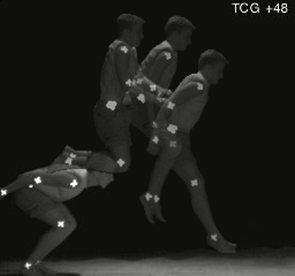
There will be many times in communicating scientific information that two or more different properties can best be compared by putting them in the same figure. If both properties are to be visualized by a 2d graph then we need to place multiple graphs in the same figure, so that comparisons can be easily made. Let’s consider a biomechanics-related example. Suppose we want to understand the mechanics of performing a standing long jump. A simple first step might be to video a person performing the motion and extract some of the quantitative motion data from the video. Figure 3 shows a man performing a standing long jump. Using video analysis software, a researcher obtained the position as a function of time of the jumper’s approximate center of mass. One interesting comparison to make is the y-component of the position and the velocity as functions of time. Since these are physically different properties they need to be on different graphs, but to aid in comparing them, we should put the two graphs in the same figure, as shown in Figure 4.
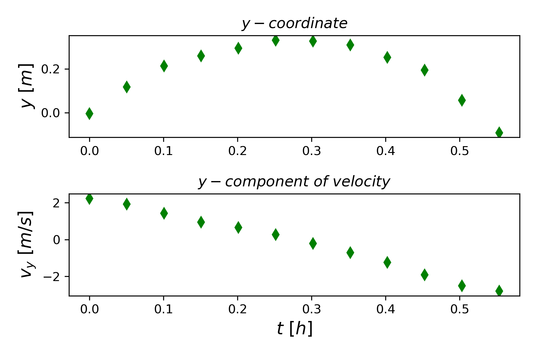
How was this figure created? We are going to use the Objected-Oriented Matplotlib interface discussed above. Figure 5 shows a listing of the program that created Figure 4. In line 20, we create an instance of the figure class that is defined in the matplotlib library, and we call the instance fig. All the methods associated with the figure class can now be used by the fig instance. We will use some of those methods to create the desired figure.
"""
Title: Standing Long Jump Subplots
Author: C.D. Wentworth
Version: 03.1.2019.1
Summary: This program illustrates a method for creating
         subplots in a single figure.
"""
import numpy as np
import matplotlib.pylab as plt

#--Main Program

# Read in data
data = np.loadtxt("StandingLJ_Data.txt",skiprows=7)
tData = data[:,0]
yData = data[:,2]
vyData = data[:,4]

# Plot data
fig = plt.figure()
f1 = fig.add_subplot(2,1,1)
f1.plot(tData,yData,linestyle='',marker='d',
color='g',markersize=6.0)
#f1.set_xlabel(r'$t [h]$',fontsize=14)
f1.set_ylabel(r'$y \ [m]$',fontsize=14)
f1.set_title(r'$y-coordinate$')
f2 = fig.add_subplot(2,1,2)
f2.plot(tData,vyData,linestyle='',marker='d',
               color='g',markersize=6.0)
f2.set_xlabel(r'$t \ [h]$',fontsize=14)
f2.set_ylabel(r'$v_y \ [m/s]$',fontsize=14)
f2.set_title(r'$y-component \ of \ velocity$')
plt.tight_layout()
plt.savefig('StandingLJ_subplots.png',dpi=300)
plt.show() In line 21 we use the add_subplot() method to create a subplot in fig, and we call the subplot f1. The meaning of the arguments are given in the following
add_subplot(nrows, ncols, index, **kwargs)where
nrows, the number of rows in the figure
ncols, the number of columns in the figure
index, a positive integer indicating the subplot being constructed
**kwargs, corresponds to a variety of optional keyword arguments
So, add_subplot(2,1,1) means that we are creating a figure with 2 rows and 1 column for subplots, and we are currently focused on the first subplot, which would be the top one. Line 22-23 creates the actual subplot. Lines 25 and 26 illustrate how we can add properties to the subplot. Line 27 creates the second subplot by using the index 2 as the third argument value. The set_tight_layout(True) method applied in line 33 allows padding to be added between parts of a figure. It has other possible arguments that can be specified to give the programming considerable control over the appearance, but often the value True will achieve the desired results.
The xlabel and ylabel arguments in the code of Figure 5 illustrate how to use the mathematics typesetting language TeX to create labels that contain more sophisticated mathematical formatting. A string enclosed by $ signs, as in $v_y \ [m/s]$, is interpreted as TeX code. The matplotlib documentation gives some basic examples of using TeX to create professional mathematical formatting (The Matplotlib Development Team, 2023b).
Uncertainty Bars
Quantitative experimental measurements always carry some uncertainty due to random variations that can occur when the same measurement is repeated. If a measurement is repeated several times to give a sample of the measurement, then typically the sample mean will be used as the value associated with the data point and the uncertainty in the mean due to random variation is given by the sample standard error. In a graph of the measurements, we want to communicate the estimated uncertainty in a particular data point, and we can do this by adding an uncertainty, or error, bar above and below the actual data point. This communicates to the reader that the actual value has a range of possible values.
As a specific example, consider vertical position data taken from a video of a dropped ball Table 1 gives the data from the data file.
| t[s] | x [m] | Dx [m] |
|---|---|---|
| 0 | 0 | 0 |
| 0.2 | 0.094 | 0.06 |
| 0.4 | 0.336 | 0.25 |
| 0.6 | 0.46 | 0.4 |
| 0.8 | 1.344 | 0.2 |
| 1 | 2.1 | 0.42 |
| 1.2 | 3.324 | 0.32 |
| 1.4 | 4.116 | 0.32 |
| 1.6 | 5.376 | 0.42 |
| 1.8 | 6.804 | 0.42 |
| 2 | 8.4 | 0.42 |
Figure 6 shows a plot of the ball’s position as a function of time. The uncertainty of each position measurement is indicated with the red bar drawn through the data points. The value of the uncertainty was read from the data file in the third column.

The key to adding error bars is to use the errorbar() method instead of the plot method when constructing the plot. Most of the arguments of errorbar() are the same as for plot(), but there is the additional keyword argument yerr, which specifies the list containing the uncertainty estimates for each data point. Line 21 of Figure 7 shows how errorbar() was used to create the graph in Figure 6.
"""
Title: Plot Data Error Bars
Author: C.D. Wentworth
Version: 12.31.2018.1
Summary: This program illustrates how to add errobars
         (or uncertainty bars) to a data point based on
         uncertainty estimates imported from the data file.

"""
import numpy as np
import matplotlib.pyplot as plt
# Read in data
data = np.loadtxt("droppedBallData.txt",skiprows=2)
tData = data[:,0]
xData = data[:,1]
dxData = data[:,2]

# Plot data
fig = plt.figure()
f1 = fig.add_subplot(1,1,1)
f1.errorbar(tData,xData,linestyle='',marker='d',
        color='g',markersize=6.0,yerr=dxData, ecolor='r')
f1.set_xlabel(r'$t [h]$',fontsize=14)
f1.set_ylabel(r'$x [m]$',fontsize=14)
plt.savefig('droppedBallWithErrorBars.png',dpi=300) The matplotlib documentation gives many examples of other plot types that might be useful (The Matplotlib Development Team, 2023a).
References
The Matplotlib Development Team. (2023a). Plot types—Matplotlib 3.7.1 documentation. https://matplotlib.org/stable/plot_types/index.html
The Matplotlib Development Team. (2023b). Writing mathematical expressions—Matplotlib 3.7.1 documentation. https://matplotlib.org/stable/tutorials/text/mathtext.html