Principles of Scientific Visualization
Motivating Problem: Comparing CO2 Emissions by Country
Carbon dioxide is a significant greenhouse gas, and fossil fuel use is the major contributor to its increase in the earth’s atmosphere. Understanding the emissions from fossil fuel use by different countries is an integral part of public policy discussions. The US Department of Energy maintains a database of such data that can be used by environmental scientists, economists, and other professionals (Boden et al., 2013). A subset of the data is shown below in Table 1. The entire dataset is available in the file fossil-fuel-co2-emissions-by-nation.csv.
| Year | Country | Total | Solid Fuel | Liquid Fuel | Gas Fuel | Cement | Gas Flaring | Per Capita | Bunker fuels (Not in Total) |
|---|---|---|---|---|---|---|---|---|---|
| 1800 | CANADA | 1 | 1 | 0 | 0 | 0 | 0 | 0 | 0 |
| 1800 | GERMANY | 217 | 217 | 0 | 0 | 0 | 0 | 0 | 0 |
| 1800 | POLAND | 111 | 111 | 0 | 0 | 0 | 0 | 0 | 0 |
| 1800 | UNITED KINGDOM | 7269 | 7269 | 0 | 0 | 0 | 0 | 0 | 0 |
| 1800 | UNITED STATES OF AMERICA | 69 | 69 | 0 | 0 | 0 | 0 | 0 | 0 |
| 1801 | CANADA | 1 | 1 | 0 | 0 | 0 | 0 | 0 | 0 |
| 1801 | GERMANY | 146 | 146 | 0 | 0 | 0 | 0 | 0 | 0 |
| 1801 | POLAND | 121 | 121 | 0 | 0 | 0 | 0 | 0 | 0 |
| 1801 | UNITED KINGDOM | 7290 | 7290 | 0 | 0 | 0 | 0 | 0 | 0 |
| 1801 | UNITED STATES OF AMERICA | 73 | 73 | 0 | 0 | 0 | 0 | 0 | 0 |
| 1802 | CANADA | 1 | 1 | 0 | 0 | 0 | 0 | 0 | 0 |
| 1802 | FRANCE (INCLUDING MONACO) | 611 | 611 | 0 | 0 | 0 | 0 | 0 | 0 |
| 1802 | GERMANY | 151 | 151 | 0 | 0 | 0 | 0 | 0 | 0 |
| 1802 | POLAND | 123 | 123 | 0 | 0 | 0 | 0 | 0 | 0 |
| 1802 | UNITED KINGDOM | 7328 | 7328 | 0 | 0 | 0 | 0 | 0 | 0 |
| 1802 | UNITED STATES OF AMERICA | 79 | 79 | 0 | 0 | 0 | 0 | 0 | 0 |
A complete description of the data in each column is provided in Table 2.
| Field Name | Order | Type (Format) | Description |
|---|---|---|---|
| Year | 1 | year | Year |
| Country | 2 | string | Nation |
| Total | 3 | number | Total carbon emissions from fossil fuel consumption and cement production (million metric tons of C) |
| Solid Fuel | 4 | number | Carbon emissions from solid fuel consumption |
| Liquid Fuel | 5 | number | Carbon emissions from liquid fuel consumption |
| Gas Fuel | 6 | number | Carbon emissions from gas fuel consumption |
| Cement | 7 | number | Carbon emissions from cement production |
| Gas Flaring | 8 | number | Carbon emissions from gas flaring |
| Per Capita | 9 | number | Per capita carbon emissions (metric tons of carbon; after 1949 only) |
| Bunker fuels (Not in Total) | 10 | number | Carbon emissions from bunker fuels (not included in total) |
The computational problem we want to solve in this chapter is to develop visualizations of the data in this table that can help in discussing the issue of greenhouse gas emissions from fossil fuel use.
What are Scientific Visualizations?
Everyone knows the quaint aphorism “A picture is worth 1000 words”. It communicates that a visual representation of information can often inform more quickly and accurately than a simple verbal description. When scientists and engineers wish to understand large amounts of data or interpret the results of a model, the same principle applies: visual representations are often more useful than the data viewed in its original form. In the age of Big Data and computer simulations, this observation takes on even more meaning and leads to the field of scientific visualization.
An excellent example of this bit of wisdom is seen in comparing Table 1 and Figure 1. The graph of temperature anomaly as a function of year identifies patterns much more straightforwardly than just looking at the data table itself. Similarly, we want to develop visualizations of the data in Table 1 that will help us identify useful patterns or trends that are difficult to see just by looking at the columns of numbers. Of course, identifying structure using visualization techniques requires some thought about how to create visualizations, and that is the subject of the scientific visualization field.
Definition of Scientific Visualization
As you might guess, allowing a bunch of academics to define a subject will lead to as many definitions as there are academics. But we can distill some common features that get us oriented to the topic. Here is our working definition of scientific visualization (Ausoni et al., 2014):
Scientific visualization is concerned with graphically representing scientific phenomena to gain understanding and insight into the system that was previously impossible.
This may be part of the research process: graphics are used for understanding, interpretation, and exploration and may guide the direction of the research itself, from tweaking parameters to raising new questions.
It may be used in production environments, such as medical procedures, as part of a larger mission.
It may be used for educational purposes, in the classroom, etc.
Classifying Scientific Visualizations
There are many approaches to classifying scientific visualizations, and our goal here is not to perform an exhaustive review. Indeed, there is a rich literature on classifying data visualizations. Some focus on the type of data being visualized (Shneiderman, 2003) ; others focus on the models and algorithms used with data rather than the data itself (Tory & Moller, 2004). Instead, we will focus on one basic model that should be useful for novice computational scientists to develop effective visualizations. We will classify visualizations according to three principal axes, as shown in Figure 1: the content type of visual model (data-based - conceptual), dimensionality of the representation (2D-3D), and the element of time in the visualization (static - dynamic).
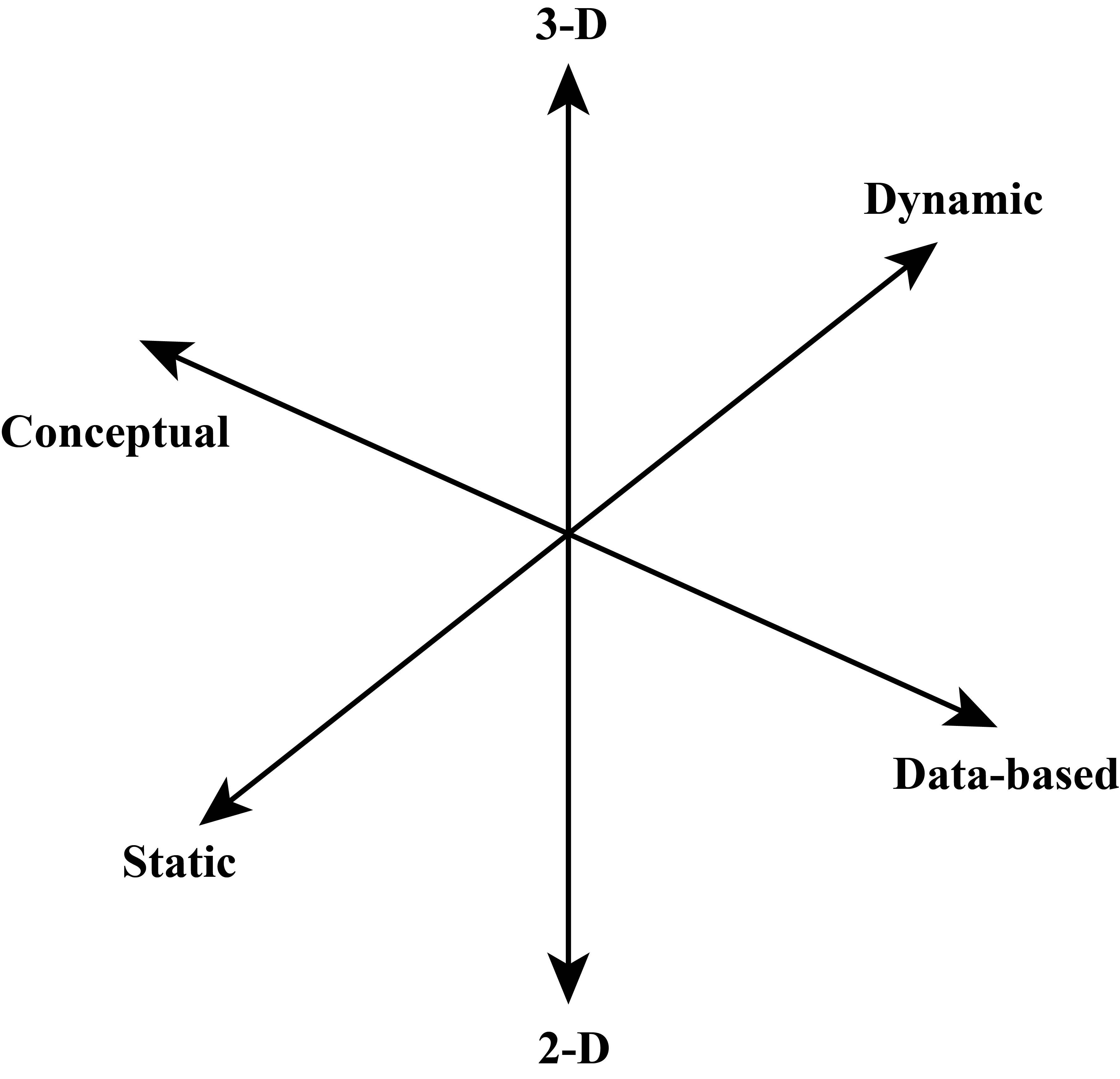
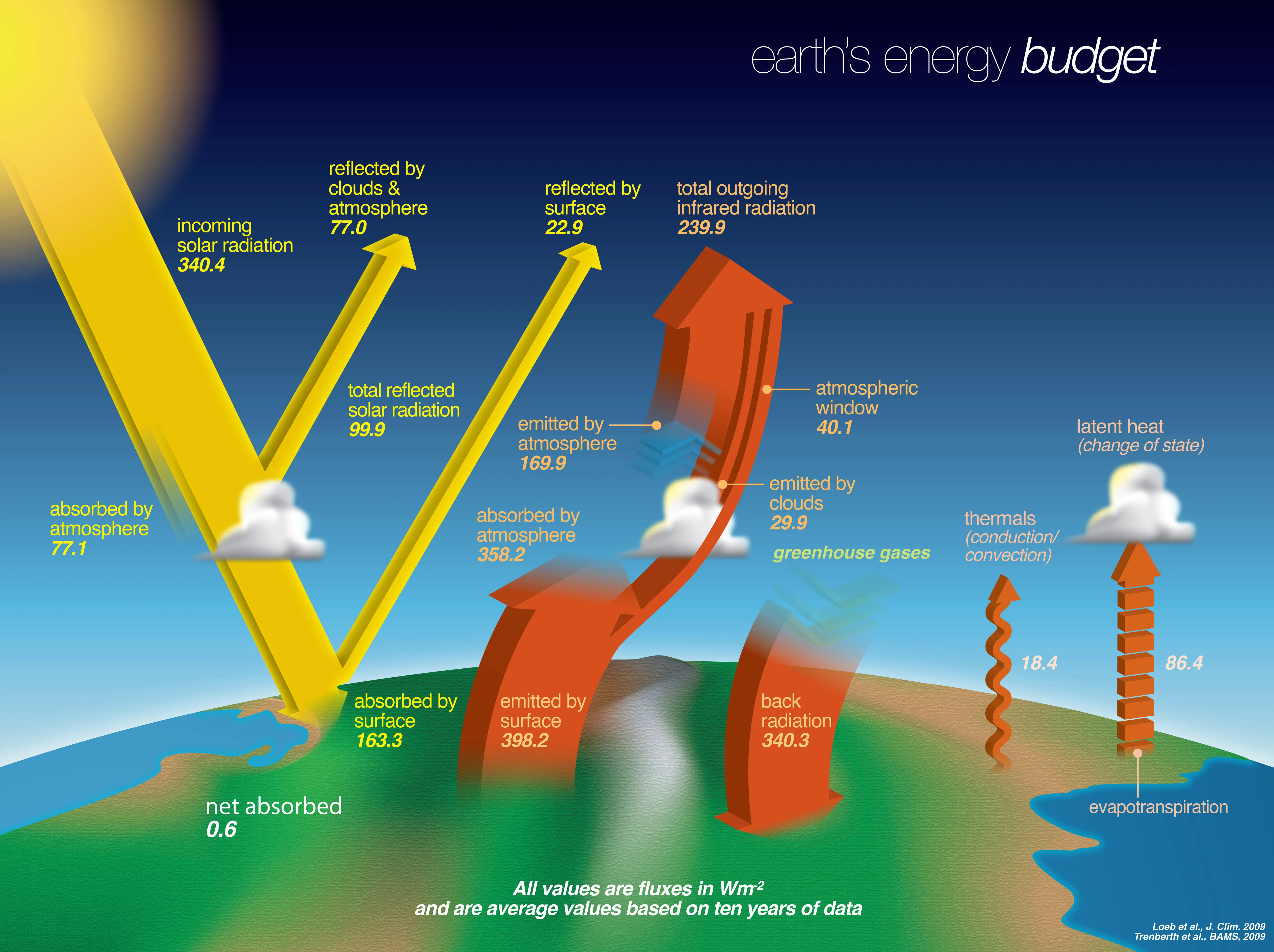
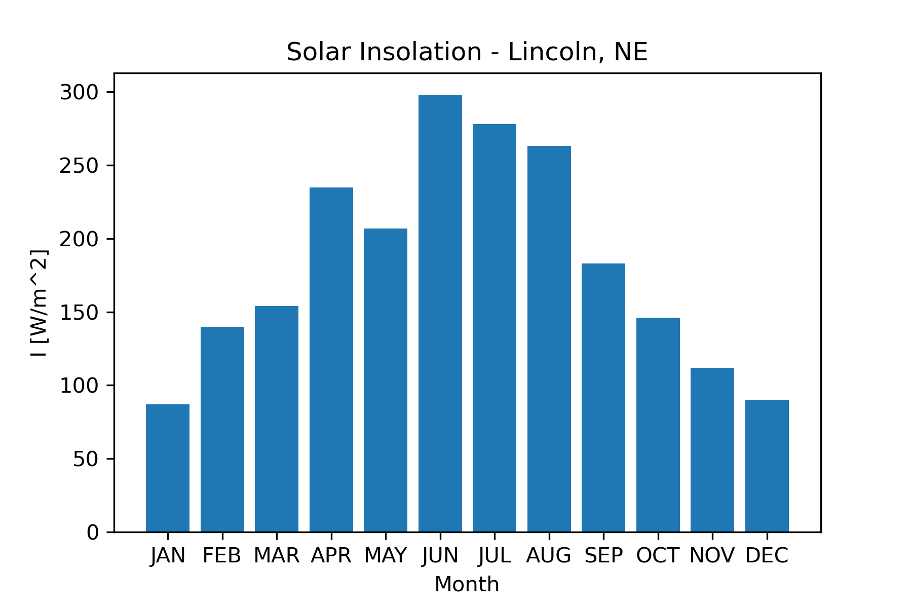
Figure 2 shows an example of a conceptual visualization. It illustrates the main elements of the earth’s energy budget. While there is some quantitative information in the visualization, the primary purpose and information content are conceptual. Figure 3 shows the measured insolation (incoming solar radiation) as a function of the month for Lincoln, Nebraska (Power Project Team, n.d.) . This is an example of a data-based visualization. It is easy to pick out the seasonal pattern when viewing the data in this form. Figure 3 also serves as an example of a 2D visualization. There are many types of 2D graphs, including XY, contour, and bar. Figure 3 is a bar graph. 2D graphs are the bread and butter for traditional scientific publications, so we will spend quite a bit of time learning how to produce these.
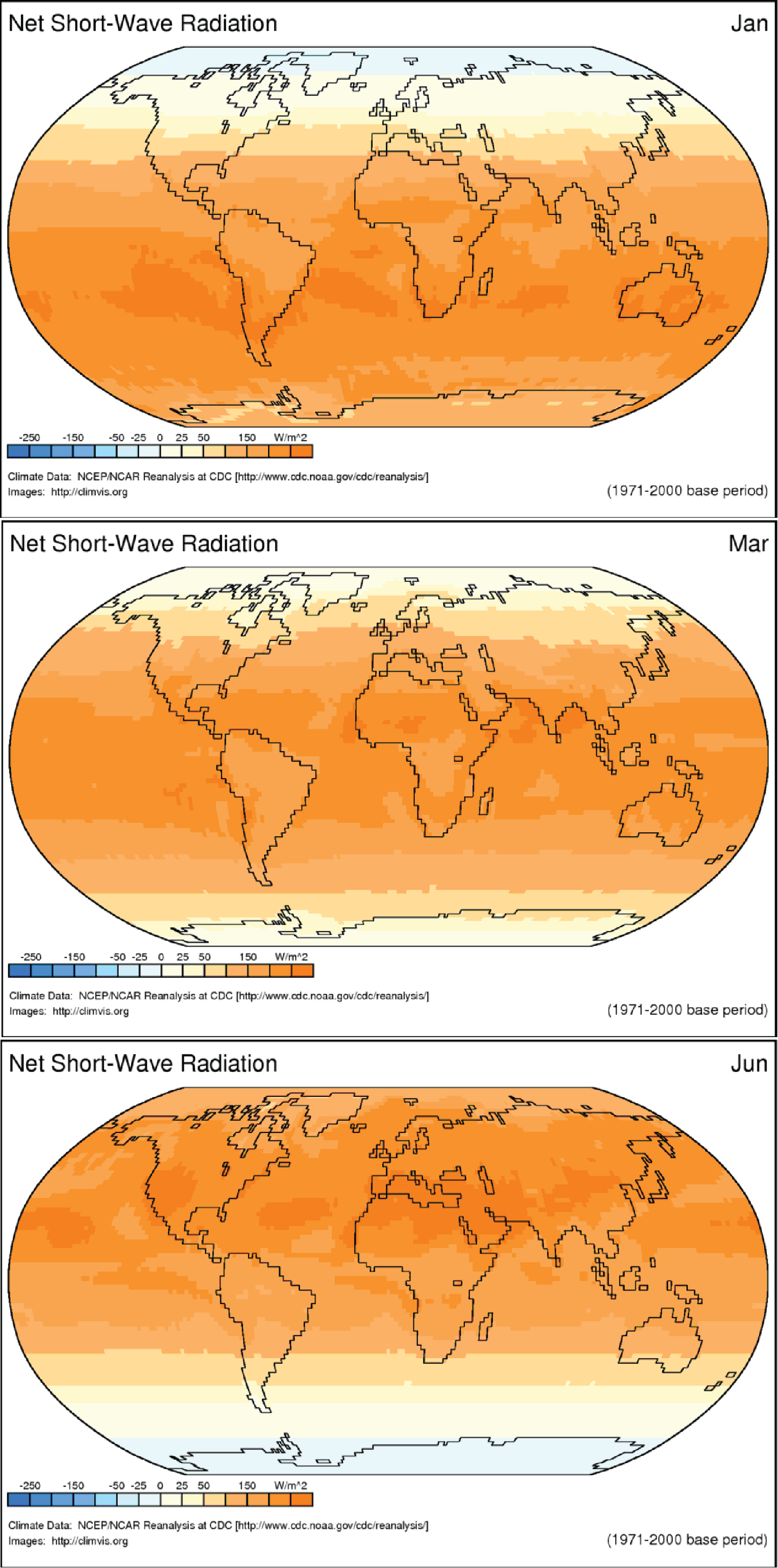
Both Figure 2 and Figure 3 are considered static visualizations since they are both static images that do not change. Dynamic visualizations such as animations that change over time are also very useful for exploring scientific data, particularly when we are interested in looking at changes over time. The following link shows the monthly average solar radiation arriving at earth’s surface for one year: Net Radiation Animation (Shinker, 2016) . Figure 4 shows three frames from the animation. This visualization is a dynamic, data-based, 2D visualization. Dynamic visualizations require more sophisticated viewing technologies than standard publications.
Python Modules for Visualization
There are several modules that make up a useful Python visualization environment. These include Numpy, Matplotlib, Pandas, and Seaborn. We introduced numpy and matplotlib previously. In this section we will cover some additional features of Matplotlib and then introduce the Pandas and Seaborn modules.
Creating 2d Graphs Using Matplotlib
In Chapter 4 we saw how to create a basic scatter graph using the plot function in the Matplotlib.pyplot module. We will now learn to customize a 2D plot. We will start with plotting functions. The following code illustrates specifying line color and line style. Figure 5 shows the result of this code.
import matplotlib.pylab as plt
import numpy as np

x = np.linspace(0,5,40)
y1 = 0.10*np.exp(0.10*x)
y2 = 0.10*np.exp(0.20*x)
y3 = 0.10*np.exp(0.30*x)
plt.plot(x,y1,color='k' , label='mu= 0.1' , linestyle='-' , linewidth=3)
plt.plot(x,y2,color='b' ,label='mu= 0.2' ,linestyle='--', linewidth=3)
plt.plot(x,y3,color='r' ,label=' mu= .3' , linestyle=-.' , linewidth=3)
plt.xlabel('x' , fontsize=14)
plt.ylabel('y' , fontsize=14)
plt.legend()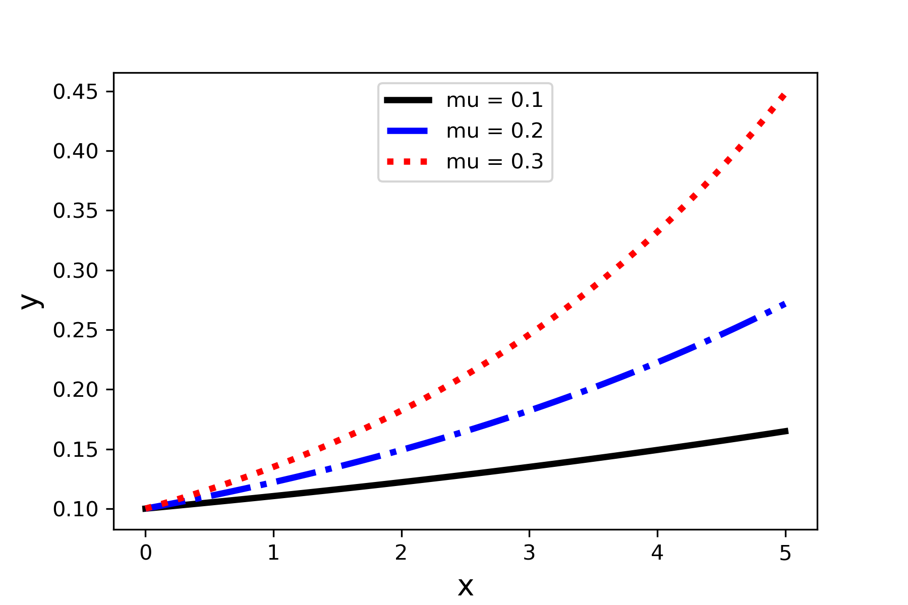
There are several things to point out about the code.
- The Numpy linspace function is used to generate a set of equally spaced numbers that can be used for the function calculations. This function generates a set of equally spaced numbers and returns them as a 1D numpy array. The syntax is
np.linspace(start, stop, num)start: starting number of the interval
stop: ending number of the interval
num: the number samples to generate
The color of a line (or data symbol) is determined by the color keyword argument. Table 3 gives the codes for the base set of colors in Matplotlib. The CSS color list gives considerably more choice. See the Matplotlib documentation for the CSS color codes (The Matplotlib development team, 2022).
The thickness of the line is set by the linewidth keyword argument. The number can be any positive float.
The type of line drawn is determined by the linestyle keyword argument. The allowed values are listed in Table 4.
| description | color | code |
|---|---|---|
| blue |

|
b |
| green |

|
g |
| red |

|
r |
| cyan |

|
c |
| magenta |

|
m |
| yellow |

|
y |
| black |

|
k |
| white |

|
w |
| code | short code | |
|---|---|---|
| Solid | ‘solid’ | ‘-’ |
| Dashed | ‘dashed’ | ‘–’ |
| Dotted | ‘dotted’ | ‘:’ |
| Dashdot | ‘dashdot’ | ‘-.’ |
| None | ‘none’ | ” |
If you do not like the default location of the legend, then you can customize it by using the loc keyword argument. The allowed strings or corresponding numerical codes are shown in Table 5.5.
plt.legend(loc='upper center') | string | number code |
|---|---|
| ‘best’ | 0 |
| ‘upper right’ | 1 |
| ‘upper left’ | 2 |
| ‘lower left’ | 3 |
| ‘lower right’ | 4 |
| ‘right’ | 5 |
| ‘center left’ | 6 |
| ‘center right’ | 7 |
| ‘lower center’ | 8 |
| ‘upper center’ | 9 |
| ‘center’ | 10 |
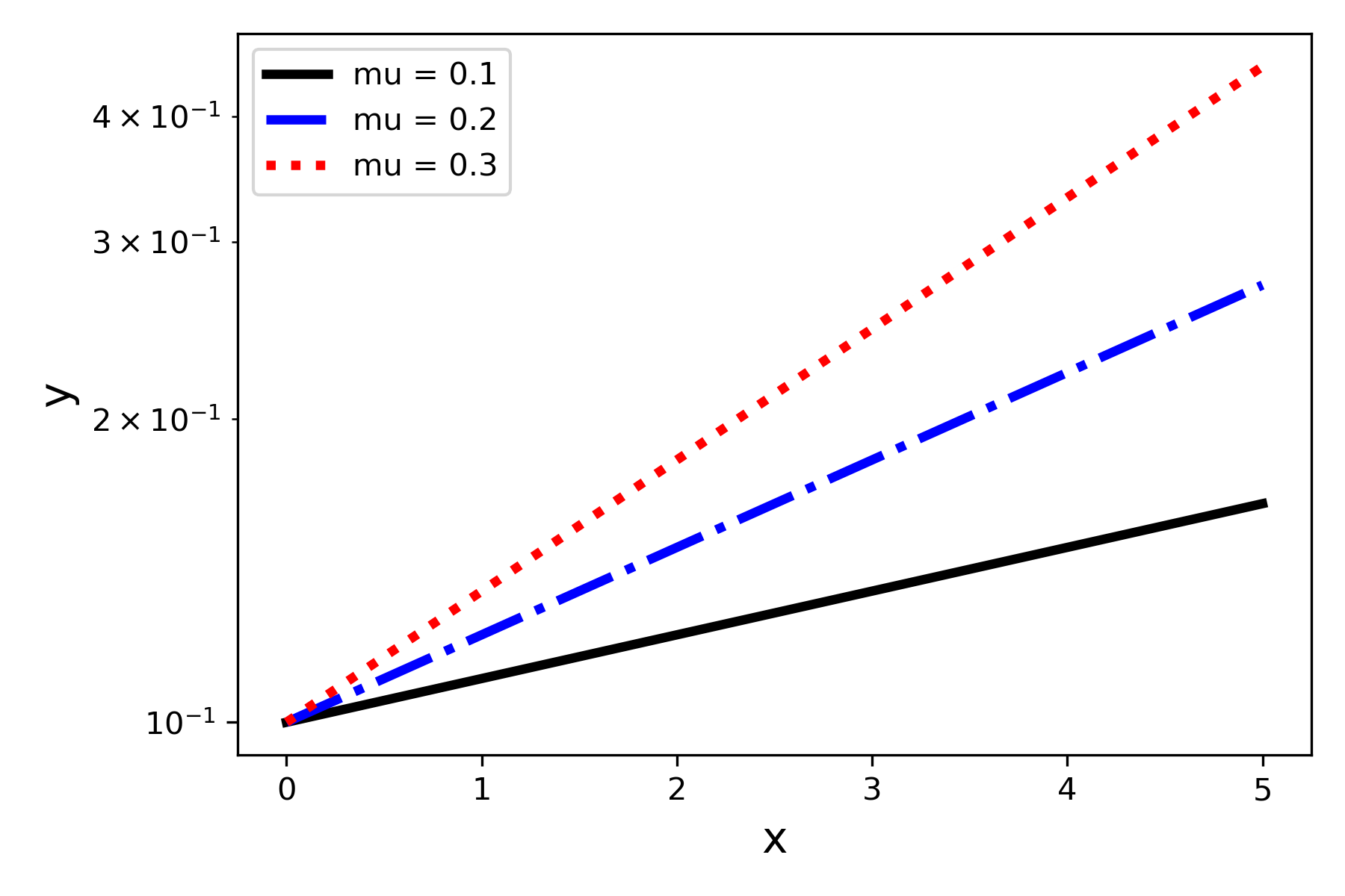
When numbers to be plotted cover a large order of magnitude range, or when we want to easily identify power law or exponential law behavior, using a logarithmic scale can be helpful. To make the y-axis use a logarithmic scale we can use the yscale function.
plt.yscale('log') Adding this to the code that produced Figure 5 gives us Figure 6.
Introduction to the Pandas Module
The Pandas module is a basic component of the Python computational science environment and is particularly helpful for problems involving data analytics (The pandas development team, 2022). It provides a useful data structure for containing data, the dataframe, and many functions for working with a dataframe. To illustrate some of the features of Pandas we will use a classic data set used for educational purposes: the Fisher Iris Flower Data Set (Fisher, 1936). This data set can be obtained in a convenient electronic form as a csv file from Kaggle (Iris Species, n.d.). This data is in the file Iris.csv.
A dataframe is a two-dimensional data structure, visualized as a 2-D grid, where each column can contain a different datatype. The data does not need to be numerical, as in the case of NumPy arrays. Each column in the dataframe has a label that will appear above the column in the first row of the grid. Each row of the grid, except for the first row containing the column labels, is indexed by a row number starting with 0. Figure 7 is a Colab Notebook excerpt that illustrates how to read in data from a csv file to create a Pandas dataframe. The Pandas function read_csv can be used to read in tab-delimited data, too, by using the header keyword argument (Pandas.read_csv — Pandas 1.4.3 Documentation, n.d.).
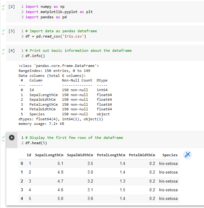
An overview of the dataframe contents can be obtained by using the Pandas info function, as shown in Figure 7. We can see a listing of the column labels and how many non-null entries each column has. This last piece of information can be helpful in deciding what kind of data clean-up must be performed. The first few rows from the dataframe can be viewed by using the head function.
The data in an individual column from the dataframe can be accessed by using a square bracket notation, where the index in the bracket is the desired column label:
ds = df['Species']In this example, the variable ds will be a pandas data series, which is a special pandas data structure that can be manipulated with appropriate pandas functions. Instead of working with pandas data series we will usually convert columns to Numpy arrays when the data type is numerical. This can be done with the to_numpy() method applied to a pandas data series. Here is an example:
SepalLength_data =
df['SepalLengthCm']}.to_numpy()
The variable SepalLength_data will be a 1D numpy array that can be used by matplotlib plotting functions, for example. Pandas has many plotting functions that can be used with dataframes, but we will usually convert dataframe columns to numpy arrays and use matplotlib for our plotting.
Introduction to the Seaborn Module
The Seaborn module is built on top of Matplotlib but offers some advantages in certain situations. Some of the advantages are
Integration with Pandas so that dataframes can be used directly without needing to convert columns to Numpy arrays.
Some useful graph types are prebuilt so that they can be implemented with a single function. One example is the pairwise or all-against-all scatterplot that we will use in 5.4.3.
There are some predefined styles that create aesthetically pleasing graphs consistent with good graphic design principles.
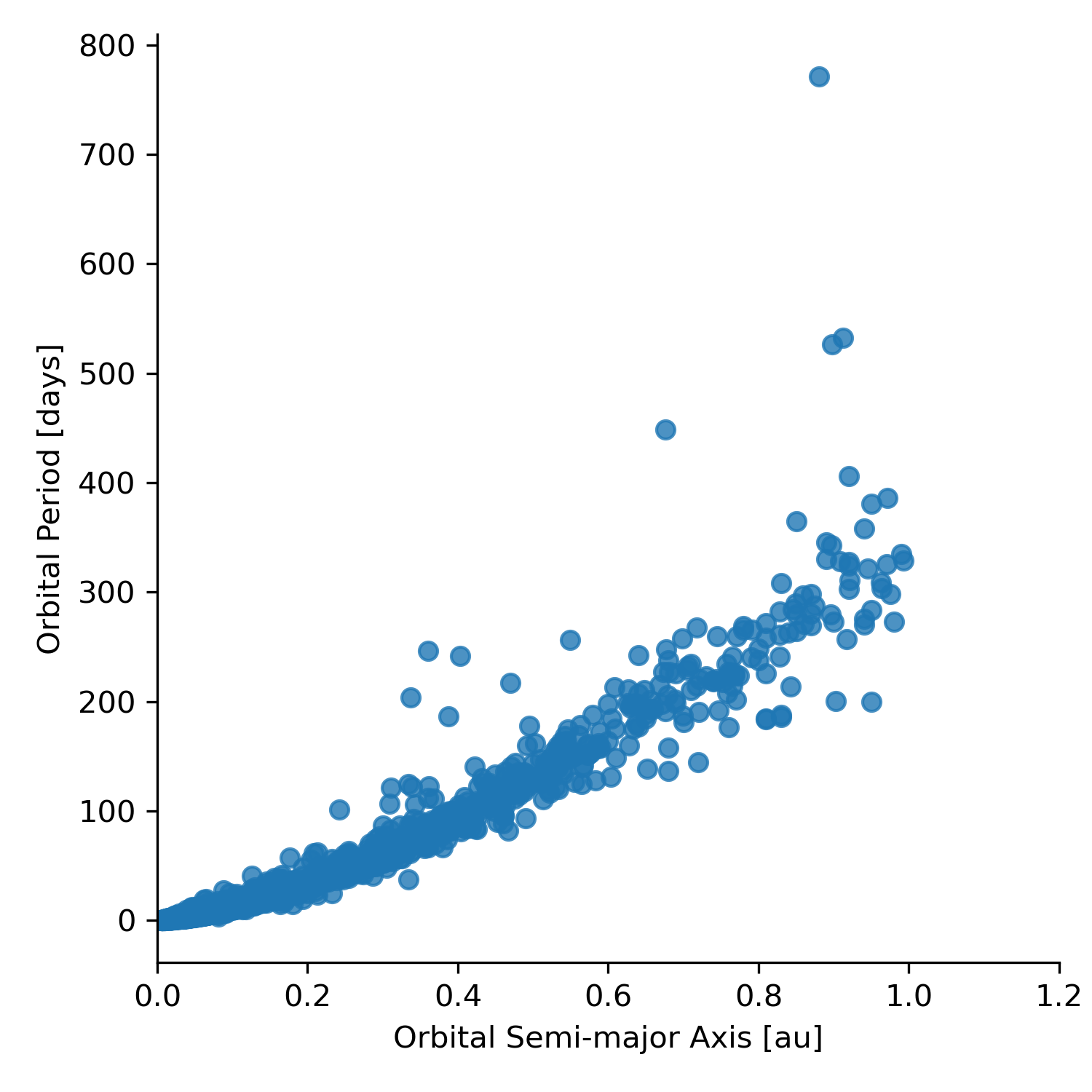
To illustrate some basic features of the Seaborn module we will use a selection of data from the NASA Exoplanet Archive (NASA Exoplanet Archive, n.d.). The data we will use is in the file PSCompPars_subset.csv. Before using the Seaborn module you must import it into your code file:
import seaborn as sns
import matplotlib.pyplot as plt
import numpy as np
import pandas as pd
Seaborn contains functions to create a wide variety of plots. One method of generating a scatterplot is to use the lmplot() function. The basic syntax is
fig = sns.lmplot(x=x_string, y=y_string, data=dataframe_name,
                 fit_reg=False)
x_string: the x-axis column heading from the dataframe
y_string: the y-axis column heading from the dataframe
dataframe_name: the Pandas dataframe containing the data
If the fit_reg keyword argument is not set to False then a linear regression line is automatically added to the graph. We will come back to performing a linear regression fit to data in Chapter 10.
Here is an example of creating a scatterplot from the exoplanet data file.
planets =
pd.read_csv('PSCompPars_subset.csv', header=16)
planets_fig = sns.lmplot(x='pl_orbsmax', y='pl_orbper', data=planets, fit_reg=False)
                            plt.xlim(0,1.5)
plt.xlabel('Orbital Semi-major Axis [au]')
plt.ylabel('Orbital Period [days]')
planets_fig.savefig('pl_orbsmax-pl_orbper.png' , dpi=300)
Note that we applied three matplotlib.pyplot functions to the Seaborn plot, xlim, xlabel, and ylabel. This illustrates a nice feature of Seaborn. We can use matplotlib to provide some customization of the plot. This can be done because Seaborn is built on top of Matplotlib. (#fig:Figure5.8)shows the result of this code.
|

|
Overall style of a graph is determined by using one of the predefined themes. This is done with
sns.set_style(theme)where theme is one of the following strings:
darkgrid, whitegrid, dark, white, ticks
Using the darkgrid theme to create the scatterplot shown in Figure 8 yields Figure 9.
Creating a Good Visualization
Solving complex scientific and engineering problems can be facilitated by using a structured approach or strategy and the same is true for developing a good scientific visualization. We will use a strategy or workflow suggested by Ben Fry (Fry, 2008).
First Steps
The first step is to start with a question that you want to answer with the visualization. Starting with data and asking what it can tell us can lead to being overwhelmed by possibilities, whereas beginning with a question before even looking for or looking at data allows us to focus the visualization that we develop in a constructive way. A second part of this initial step is to define the audience for the visualization. Some helpful questions to define the audience include
Are they science professionals used to looking at graphs?
What information would they expect in a visualization?
How much time will they devote to looking at the visualization?
Visualization Development Workflow
Once we have defined a question and our audience, Fry suggests the following workflow (Fry, 2008):
Acquire - Obtain the data, whether from a file on a disk or a source over a network.
Parse or Understand the Data - Provide structure for the data’s meaning, and order it into categories.
Filter – Clean the data and remove all but the data of interest.
Mine – Use methods from statistics, data mining, or more fundamental scientific principles to discern patterns or place the data in a mathematical context.
Represent - Choose a basic visual model, such as a bar graph, scatter graph, contour plot, or other visual construct.
Refine - Improve the basic representation to make it clearer and more visually engaging.
Interact - Add methods for manipulating the data or controlling what features are visible.
The last step, adding interaction, will not be discussed in this book.
Iris Flower Example
As an example, we will explore some properties of the iris flower contained in the classic educational data set originally created by R.A. Fisher (Fisher, 1936). The question guiding our visualization development is
Can sepal or petal measurements be used to distinguish species of the iris flower?
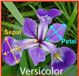
The sepal is the part of the flower that protects the petals in the flower bud. Figure 10 shows an example of an iris flower.
We will step through the workflow defined above to develop visualizations that can help answer the question.
Acquire
We can easily acquire a nice dataset related to the iris flower already in a convenient electronic form as a csv file from Kaggle (Iris Species, n.d.). This data is in the file Iris.csv.
Parse
We must parse or inspect the dataset to understand the properties or measurements that are included and whether any cleanup must be done. The pandas module contains some useful functions for inspecting a data frame. Therefore, we should first read the data in the Iris.csv file as a pandas data frame, as discussed in section 5.3. Next, we inspect the dataframe using the pandas info function. The output is shown in Figure 7 . The output shows that all the columns are numerical data, except for the Species column. We can also see that there are 150 rows, or records, of data and that there are no null values. This will help us in the next step of filtering the data.
| Property | Value |
|---|---|
| Number of Observations | 150 |
| Number of Attributes for each observation | 5 |
| Attributes observed | sepal length sepal width petal length petal width species |
| Number of null values | 0 |
Filter
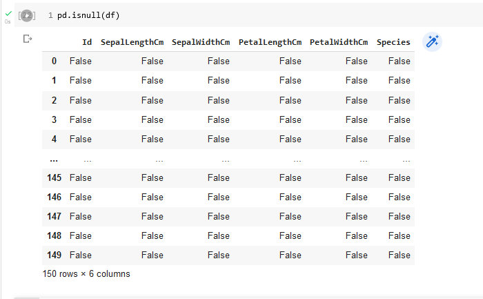
Filtering data involves removing data that will not be needed. Part of this process is to clean up the data by removing null values or removing records (rows in a pandas dataframe) that contain null values. We can determine whether there are null values by looking at the results from the pandas info function or by using the isnull function. The output from the info function applied to the iris flower dataframe already tells us that we do not have null values in the data set. The output from the isnull function, shown in Figure 11 , can also tell us this result. It specifies whether each value in the dataframe is null (True) or not null (False). We would have to inspect all rows to verify the result. Note that the output of the isnull function is another pandas dataframe.
One way to verify that there are no null values in a column of the dataframe is to sum up the values of the corresponding column in the isnull dataframe. For example, the following code would check on the existence of null values in the SepalLengthCm column.
isnull_result = pd.isnull(df)
sepal_length_number_of_nulls = isnull_result['SepalLengthCm'].sum()
The value of sepal_length_number_of_nulls would come out to be 0. This works because the Boolean value False is interpreted as a 0 in the sum function. We can perform this check on all columns with the following
We are fortunate, in this example, to be working with a clean data set.
Mine
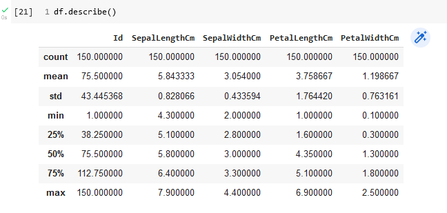
To mine our data set requires performing some exploratory data analysis so that we can begin to discern any patterns in the data. Basic descriptive statistics on each column, representing a particular measured attribute, can be obtained with the pandas describe function. Figure 12 shows the result for the iris flower dataframe.
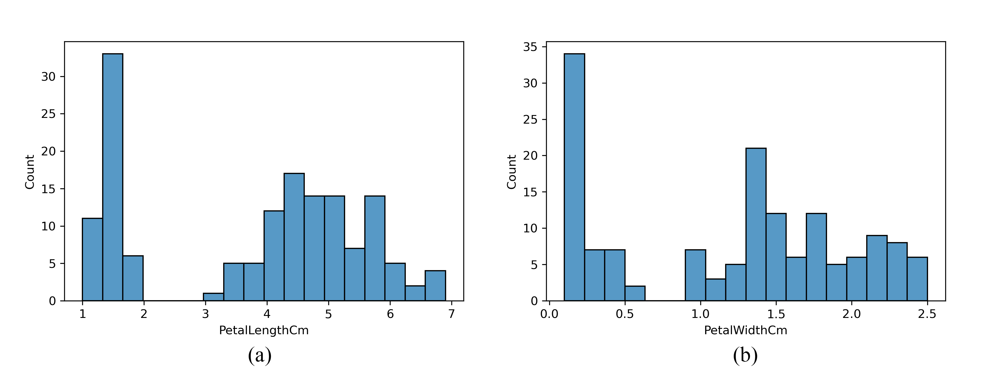
Looking at a histogram for each numerical observation can be an informative part of exploratory data analysis. The Seaborn module has a histogram function that will create professional-looking histograms. To generate a histogram of the petal length measurements, use the following
sns.histplot(df, x='PetalLengthCm' , bins=18)Figure 13 shows the resulting histograms for both petal measurement. Note that there is an interesting double peak structure which may be related to the species.
When we have multivariate data to explore a pairwise or all-against-all scatterplot can be useful to identify possible correlations and clustering in the data. A quick way to produce such a plot when the data is in a pandas dataframe is to use the seaborn module pairplot function.
import seaborn as sns
g = sns.pairplot(df,hue="Species")
g.savefig('iris_pairplot.png' , dpi=300)
Figure 14 shows the resulting pairwise plot. The diagonal plots in the matrix are the frequency distributions for the variable indicated by the column or row label.
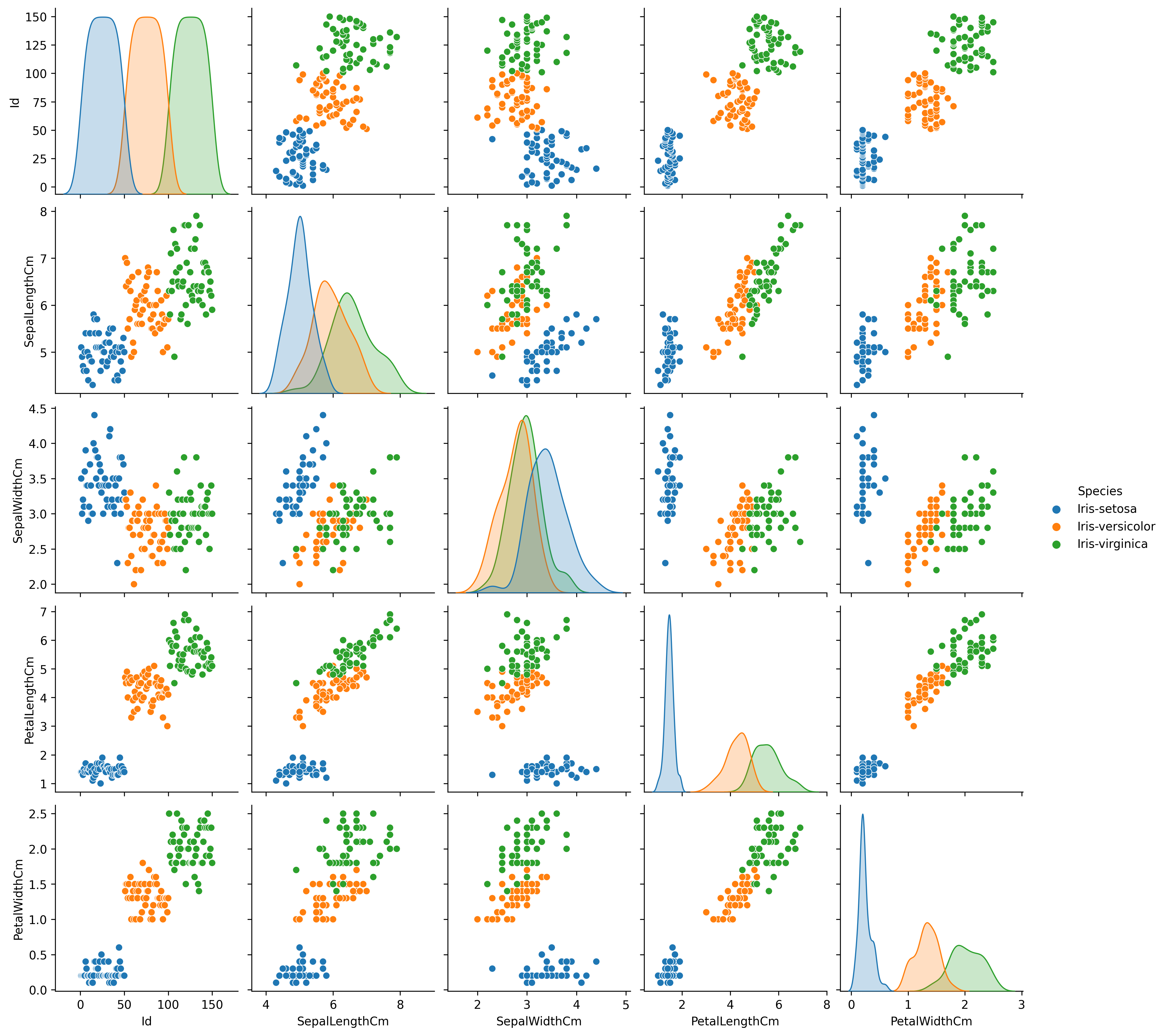
Looking at the pairwise plot suggests that the following plots might be useful in identifying species:
petal length versus sepal length
petal length versus sepal width
petal length versus petal width
To extract the data required for producing these three plots using matplotlib we will create new pandas dataframes containing one species each and then extract the numerical columns and convert them to numpy arrays. Figure 1.15 shows the code that will accomplish this.
# Create a dataframe for each species
setosa = df.loc[df['Species']=='Iris-setosa']
versicolor = df.loc[df['Species']=='Iris-versicolor']
virginica = df.loc[df['Species']=='Iris-virginica']

# Create numpy arrays containing the numerical measurements
setosa_np = setosa.loc[:,['SepalLengthCm','SepalWidthCm','PetalLengthCm',
          'PetalWidthCm']].to_numpy()
versicolor_np = versicolor.loc[:,['SepalLengthCm','SepalWidthCm','PetalLengthCm',
          'PetalWidthCm']].to_numpy()
virginica_np = virginica.loc[:,['SepalLengthCm','SepalWidthCm','PetalLengthCm',
          'PetalWidthCm']].to_numpy()
Represent
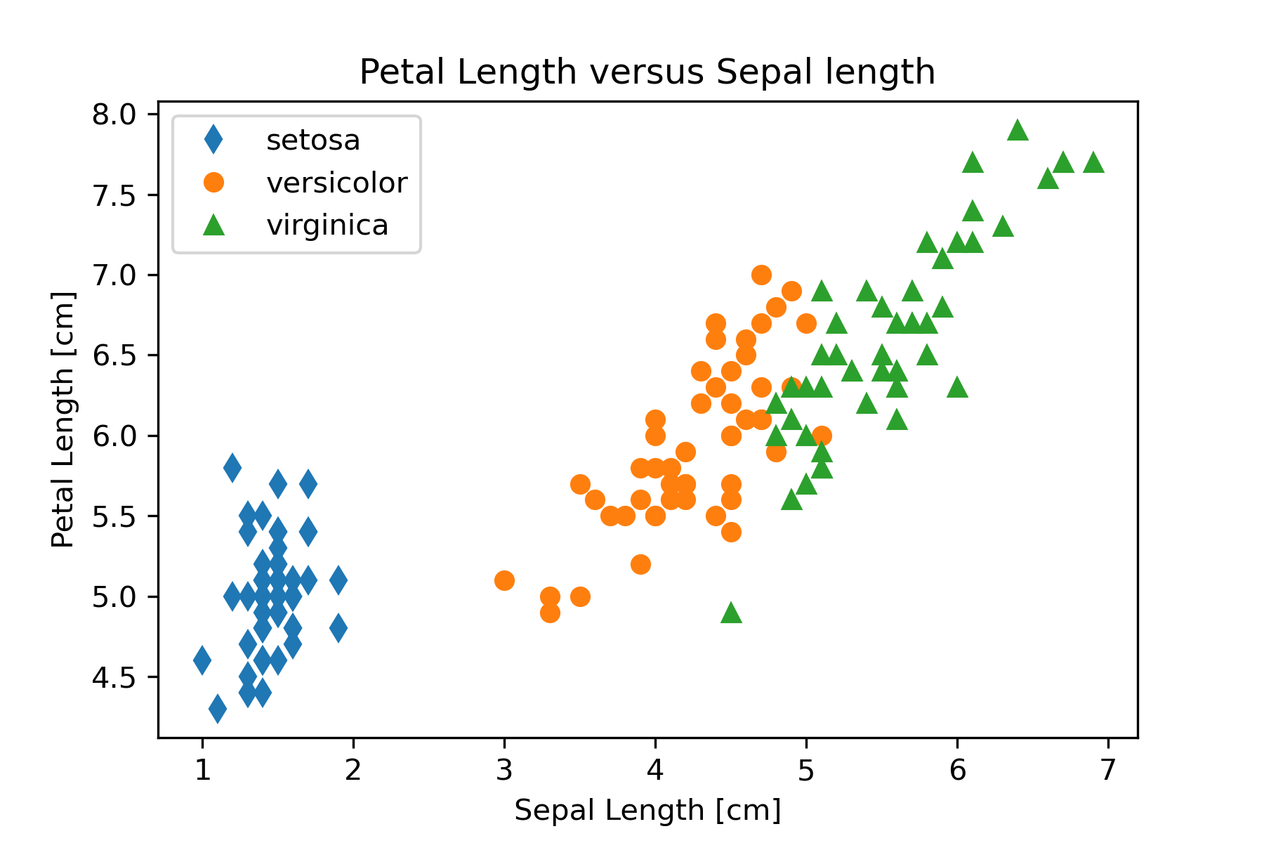
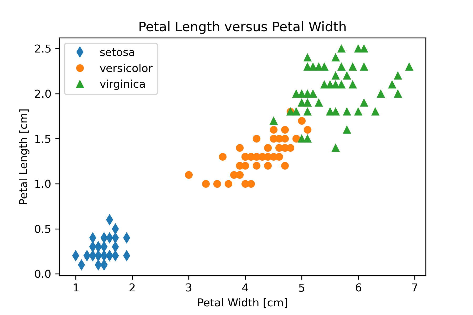
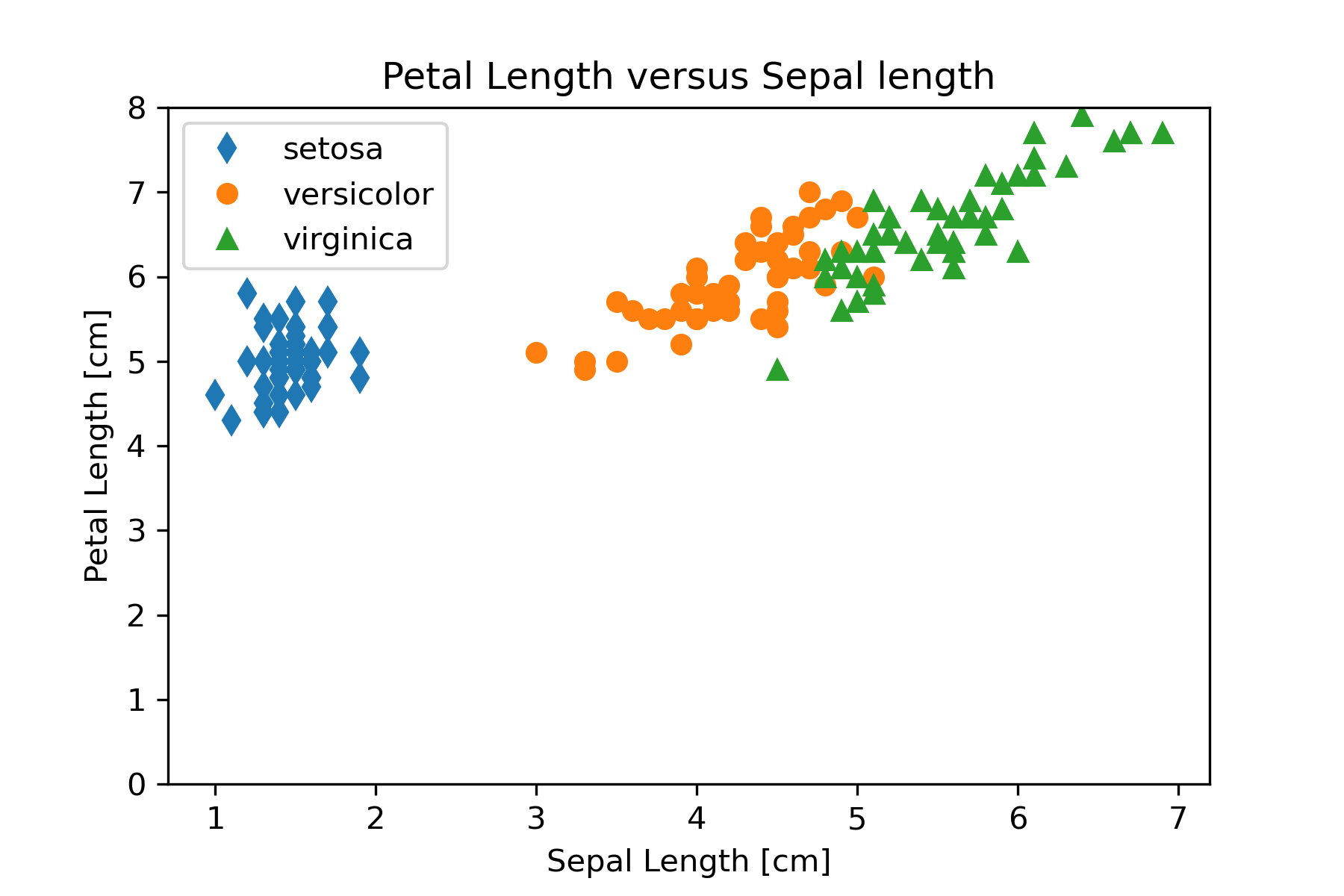
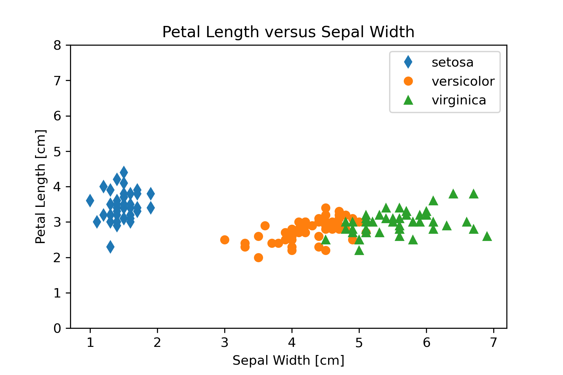
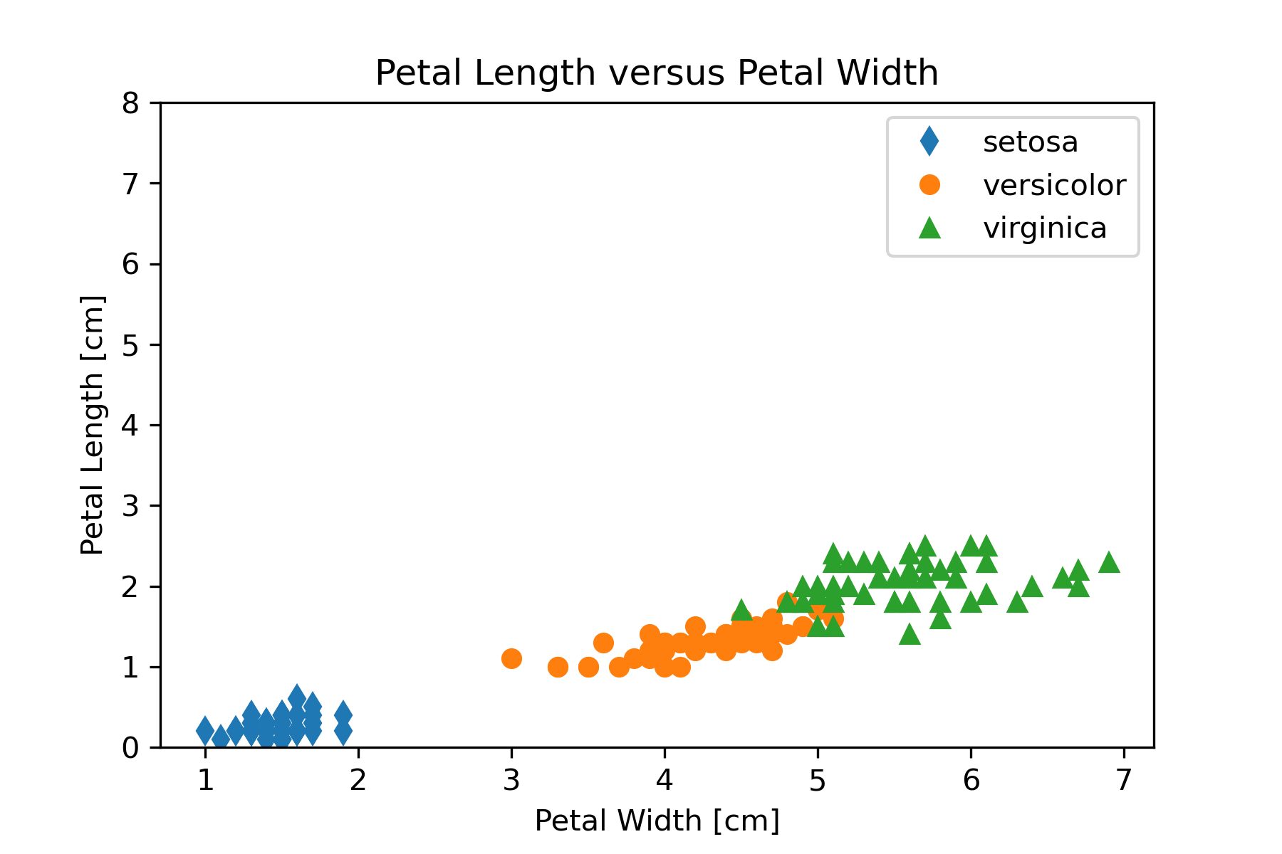
Based on the exploratory data analysis performed in the mining part of our workflow we want to construct three scatter graphs that show petal lengths versus sepal lengths, sepal widths, and petal widths. We will use matplotlib so that we have greatest control over the final appearance of the plots. The code in Figure 15 can be used for the petal length versus sepal length graph.
# Create Petal Length versus Sepal Length plot
plt.plot(setosa_np[:,2],setosa_np[:,0], linestyle='', marker='d',
          label='setosa')
plt.plot(versicolor_np[:,2],versicolor_np[:,0], linestyle='', marker='o',
          label='versicolor')
plt.plot(virginica_np[:,2],virginica_np[:,0], linestyle='', marker='^',
          label='virginica')
plt.legend()
plt.xlabel('Sepal Length [cm]')
plt.ylabel('Petal Length [cm]')
plt.title('Petal Length versus Sepal length')
plt.savefig('PetalLengthVsSepalLength.png', dpi=300)This code can be modified to produce the other two graphs by changing the column used for the y axis in the plot function. Figure 16 shows the three graphs created in this step of the workflow.
|
|
|
|
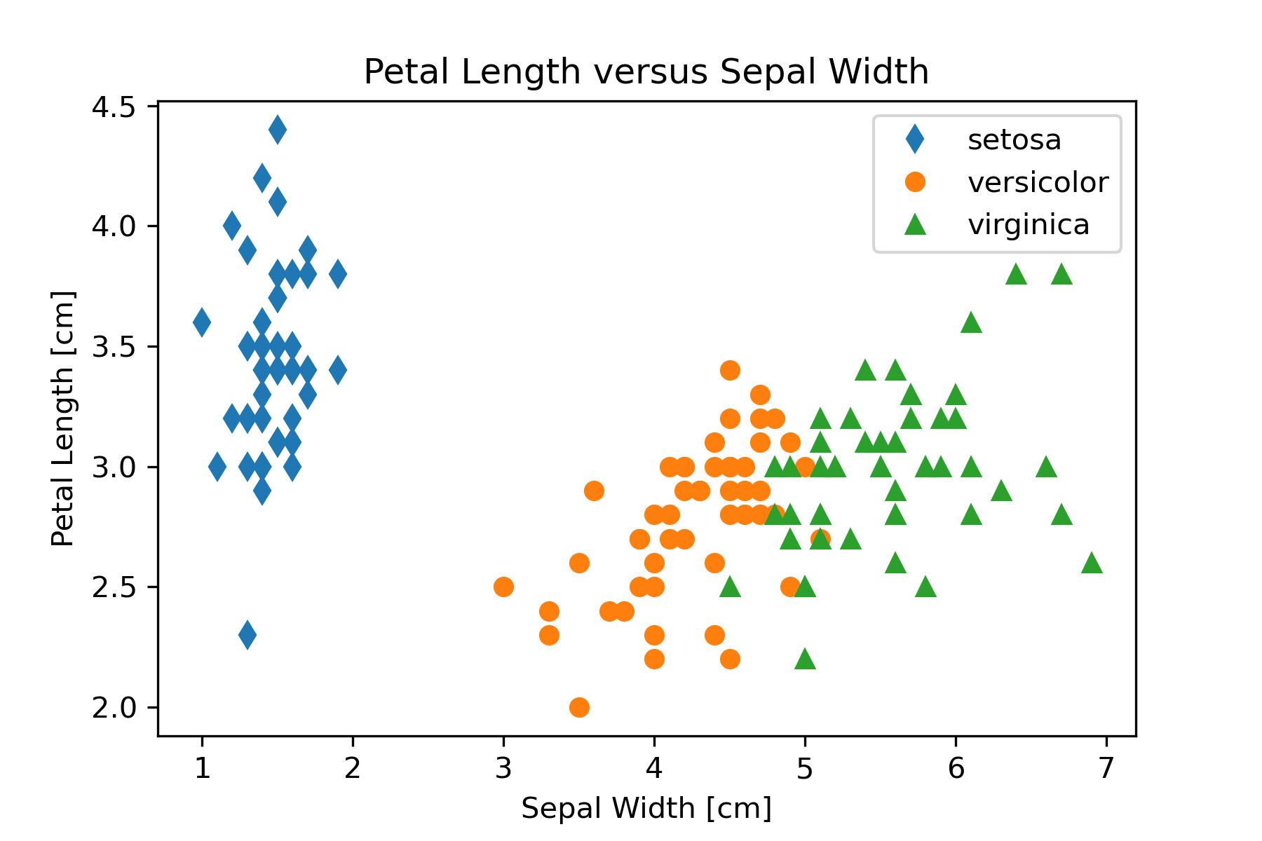
Refine
We should refine our visualization to clarify the representation or by changing attributes that contribute to readability. One thing that might be changed in Figure 16 to aid comparing the graphs is to make the y-axis scale the same. We can set the y-axis scale with
plt.ylim((0,8))The result of putting this statement in the code is Figure 17.
|
|
|
|
Computational Problem Solution: Comparing CO2 Emissions by Country
As a final example of developing scientific visualizations, we return to the problem posed at the beginning of the chapter: looking at CO2 emissions from fossil fuel use. We will focus on two questions.
How do nations of the world compare in their CO2 emissions from fossil fuel use for a recent year?
How has the CO2 emission from fossil fuel use changed over time for the highest emitters?
Our target audience will be policymakers in government.
Acquire - Obtain the data
We will use a subset of data from the U.S. Department of Energy (Boden et al., 2013). The subset is provided in the csv file fossil-fuel-co2-emissions-by-nation.csv. A description of each column in the file, including units used is in Table 2.
Parse or Understand the Data - Provide structure for the data’s meaning, and order it into categories.
We will import the data as a Pandas dataframe and then look at information about the data set using the pandas info and describe functions. Screenshots of the Colab notebook that performs these operations are shown in Figure 18 and Figure 19.
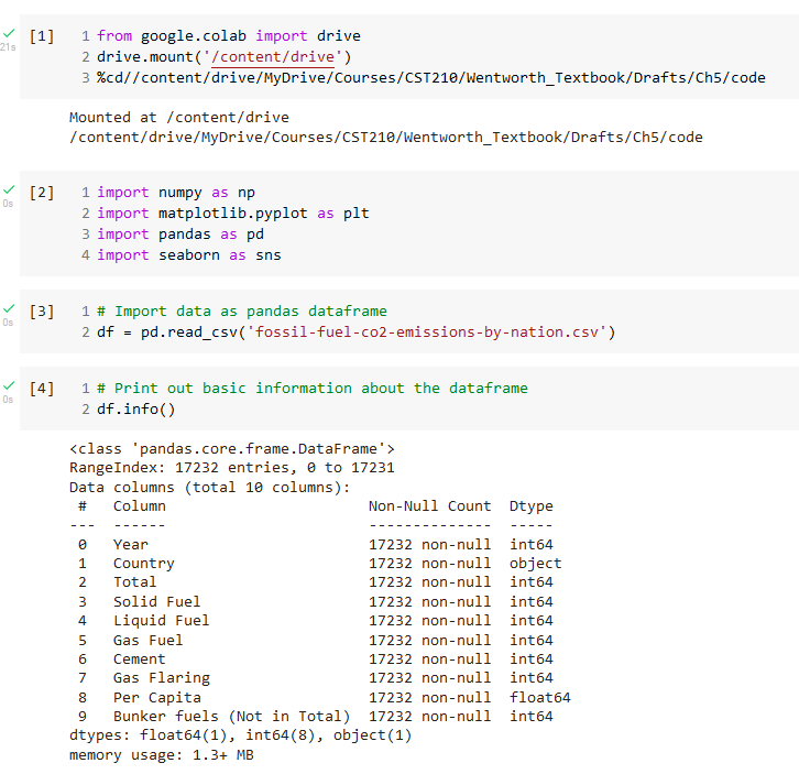
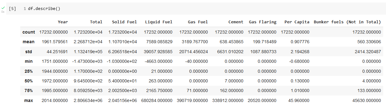
One important observation from the describe results is that the final year for which we have data is 2014.
Next, we check for any null values in the dataset that would have to be removed using the pandas isnull function. The results are shown in Figure 20.
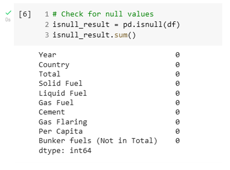
Filter – Clean the data and remove all but the data of interest.
Again, we are fortunate in that the data set is relatively clean. There are no null entries that must be deleted to work with the plotting functions. It is likely that we will need to extract a subset of the data to focus on answering the questions that we posed. The data for 2014 can be extracted into its own dataframe with
# Extract rows for 2014
data_2014 = df.loc[(df['Year'] == 2014) & (df['Total']>5.e4)]
data_2014_sort = data_2014.sort_values('Total', ascending=False)
Mine – Use methods from statistics, data mining, or more fundamental scientific principles to discern patterns or place the data in a mathematical context.
Creating histograms for each measurement ends up not being very informative, except to show that most countries have very low emissions for most years. The high emitter countries dominate.
A basic pairwise or all-against-all scatterplot can be produced with the following code
g = sns.pairplot(df, corner=True)
g.savefig('CO2Emissions_pairplot.png', dpi=300)
The corner keyword argument is used to produce a plot containing the bottom left triangle of plots, since the top right triangle contains the same information with axes reversed. Figure 21 shows the result.
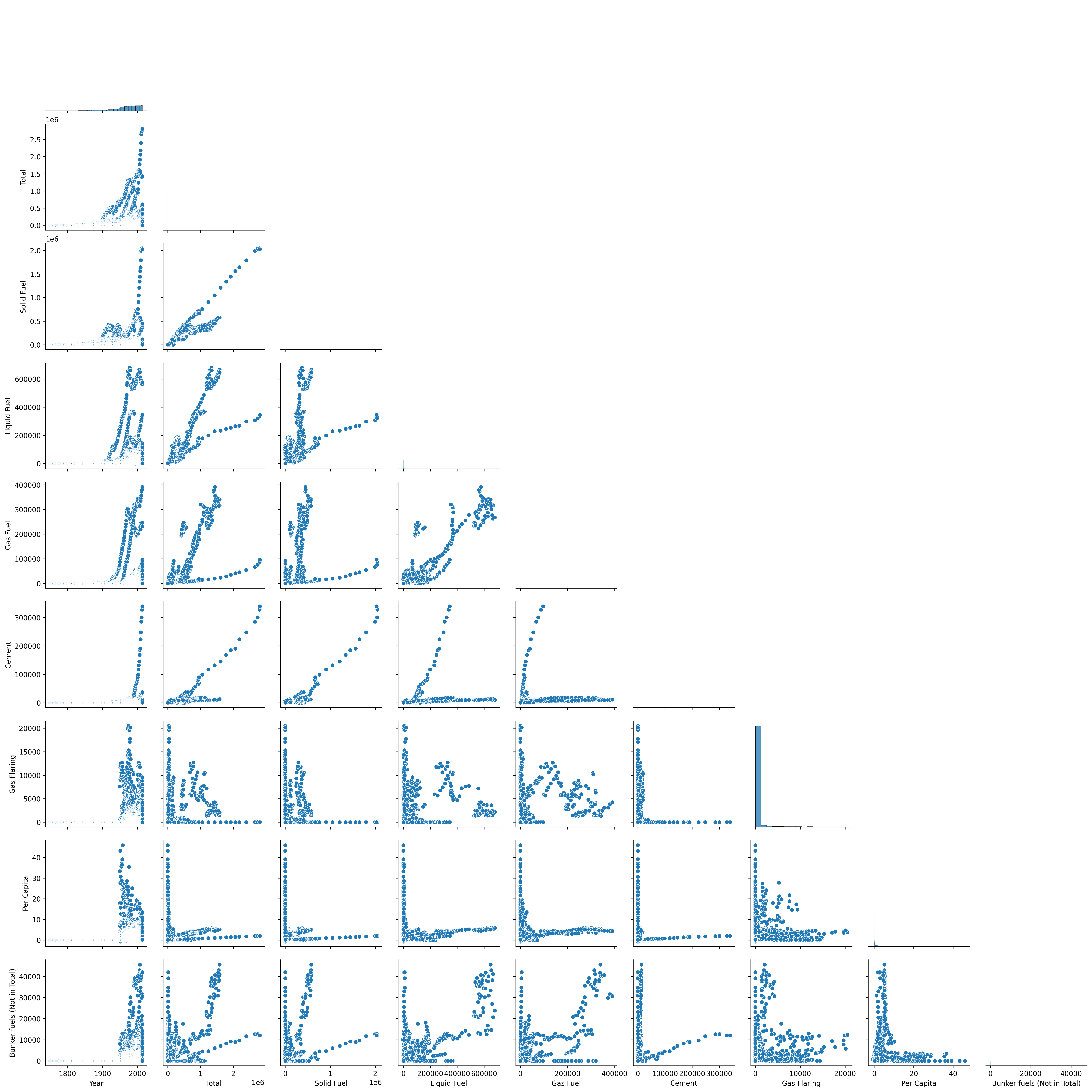
There are some interesting correlations suggested in Figure 5.20, but they are probably not relevant for answering our questions.
Represent - Choose a basic visual model, such as a bar graph, scatter graph, contour plot, or other visual construct.
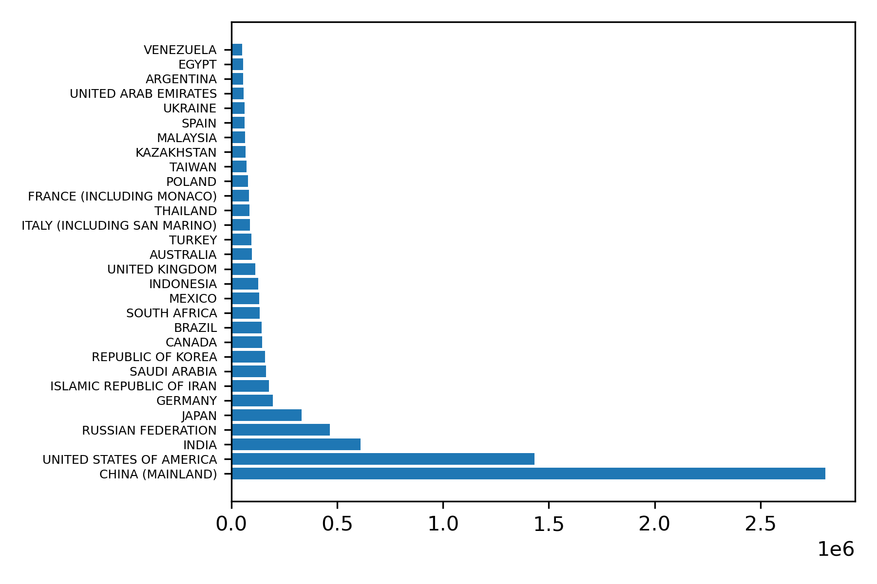
A bar chart will be a good way of comparing country data for 2014, the most recent year for which we have data. We will use the matplotlib horizontal bar plot function, barh. We must extract the relevant columns from the dataframe and convert them to numpy arrays. The following code will generate an appropriate bar plot.
# Convert columns to numpy arrays
Country_data = data_2014_sort['Country'].to_numpy()
Total_data = data_2014_sort['Total'].to_numpy()
plt.barh(Country_data, Total_data)
plt.yticks(fontsize=6)
plt.tight_layout()
plt.savefig('CO2Emissions2014.png', dpi=300)
The result is Figure 22.
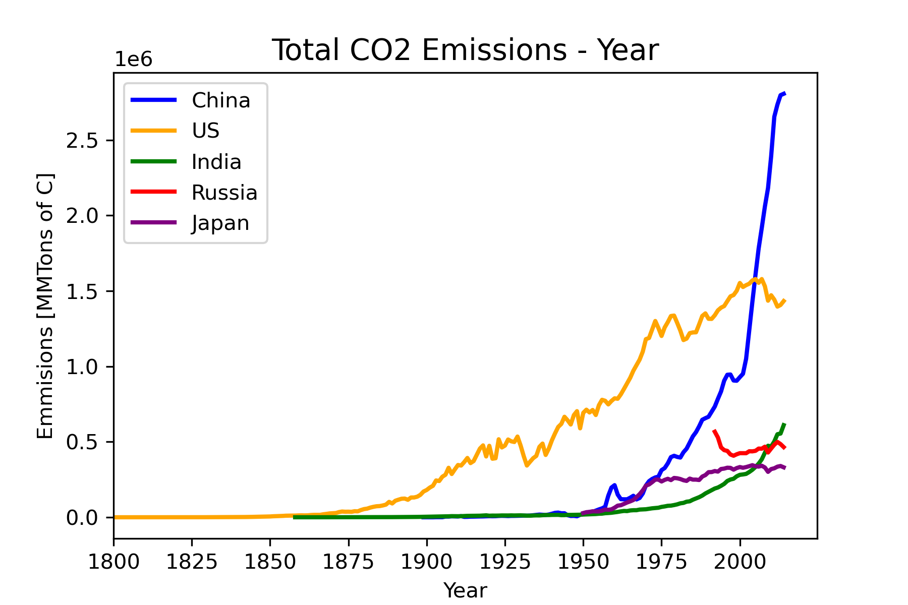
To address the question of how emissions have changed over time for the high emitter countries we will use a scatterplot that shows total emission in a year as a function of year. We will focus on the top five emitters: China, United States, India, Russian Federation, and Japan, shown in Figure 23.
Refine
The final version of the horizontal bar plot should have an x-axis label and a title. This is accomplished with the code in Figure 24. Note the additions in lines 31-33. The result is shown in Figure 25.
"""
Title: Fossil Fuel CO2 Emissions - 2014
Author: C.D. Wentworth
Version: 7.31.2022.2
Summary: This program will read in U.S. Dept. of Energy data for
         CO2 emissions by fossil fuel and produce a bar graph for
         the year 2014.

Revision History:
    7.31.2022.1: base
    7.31.2022.2: adjusts font size for the y-axis

"""
import numpy as np
import matplotlib.pyplot as plt
import pandas as pd
import seaborn as sns
# Import data as pandas dataframe
df = pd.read_csv('fossil-fuel-co2-emissions-by-nation.csv')

# Extract rows for 2014
data_2014 = df.loc[(df['Year'] == 2014) & (df['Total']>5.e4)]
data_2014_sort = data_2014.sort_values('Total', ascending=False)

# Convert columns to numpy arrays
Country_data = data_2014_sort['Country'].to_numpy()
Total_data = data_2014_sort['Total'].to_numpy()

# Create bar plot using matplotlib
plt.barh(Country_data, Total_data)
plt.xlabel('Emissions [MMTons of C]')
plt.title('Total CO^2 Emissions for 2014', fontsize=14)
plt.yticks(fontsize=6)
plt.tight_layout()
plt.savefig('CO2Emissions2014V2.png', dpi=300)
plt.show()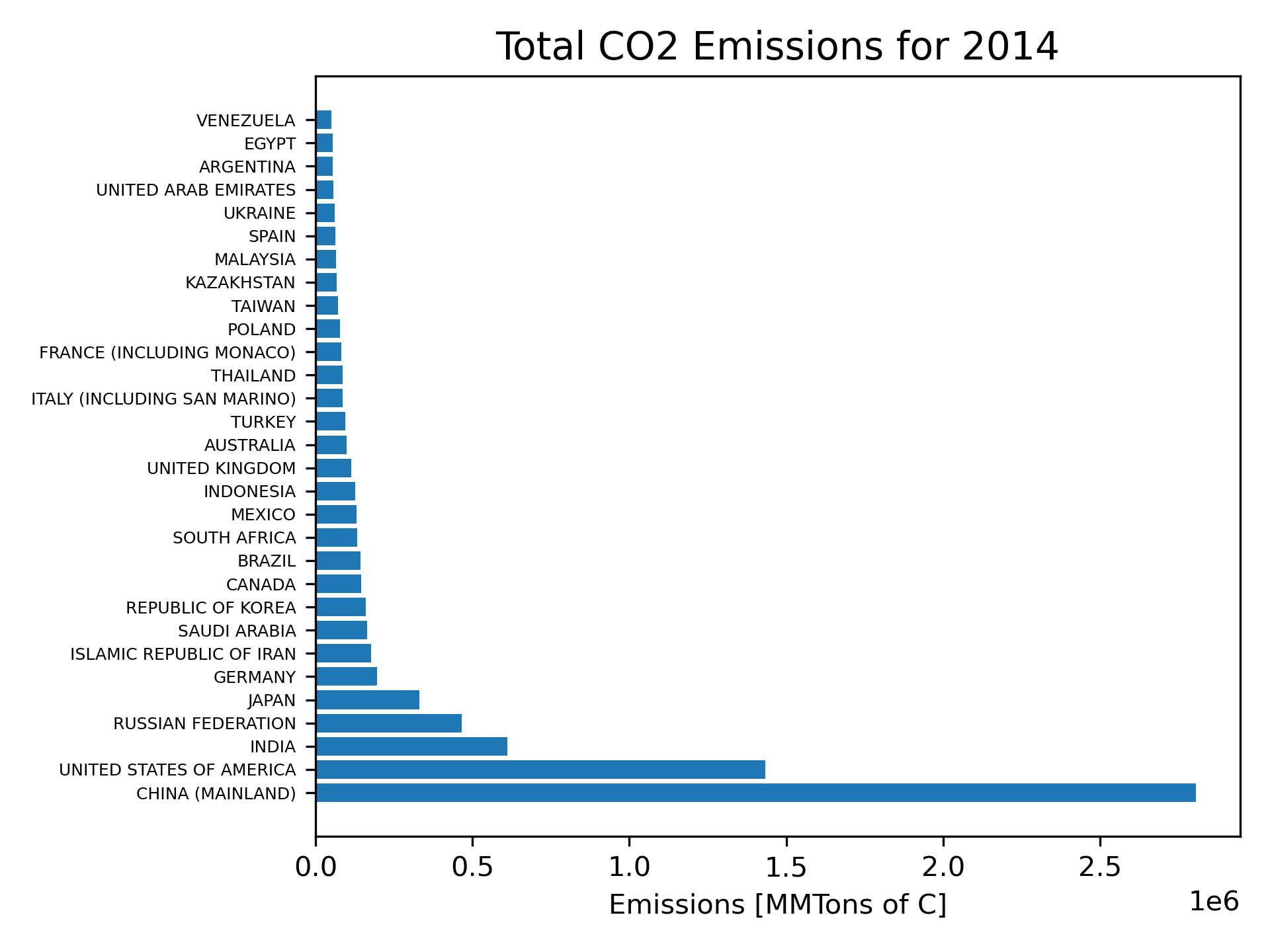
Figure 23 shows no measurable emissions for any of the displayed countries before 1850 on the chosen y-axis scale, therefore it would be better to define the x-axis limits to start with 1850. To show data for Russia over the same time period we would need to create a data series that combines the USSR with Russia. To avoid this complication, we will just delete Russia from the displayed countries. Since color will not always show for printouts of the graph, we will use grayscale colors, line width and line style changes to help distinguish the different countries. Figure 26 shows the code for the final form of the plot. Figure 27 shows the final plot.
"""
Title: Fossil Fuel CO2 Emissions Versus Year
Author: C.D. Wentworth
Version: 7.31.2022.2
Summary: This program will read in  U.S. Dept. of Energy data for
         CO2 emissions by fossil fuel and produce a scatter graph for
         of emissions versus year.
Revision History:
    7.31.2022.1: base
    7.31.2022.2: change x-axis scale and linestyles

"""
import numpy as np
import matplotlib.pyplot as plt
import pandas as pd
import seaborn as sns

# Import data as pandas dataframe
df = pd.read_csv('fossil-fuel-co2-emissions-by-nation.csv')

# Extract rows of particular countries
China_data = df.loc[df['Country'] == 'CHINA (MAINLAND)']
US_data = df.loc[df['Country'] == 'UNITED STATES OF AMERICA']
India_data = df.loc[df['Country'] == 'INDIA']
Japan_data = df.loc[df['Country'] == 'JAPAN']

# Convert columnes to numpy arrays
China_data_year = China_data['Year'].to_numpy()
China_data_total = China_data['Total'].to_numpy()
US_data_year = US_data['Year'].to_numpy()
US_data_total = US_data['Total'].to_numpy()
India_data_year = India_data['Year'].to_numpy()
India_data_total = India_data['Total'].to_numpy()
Japan_data_year = Japan_data['Year'].to_numpy()
Japan_data_total = Japan_data['Total'].to_numpy()


# Create scatter plot - matplotlib
plt.plot(China_data_year, China_data_total, linewidth=5, color='silver',
         linestyle='--', label='China')
plt.plot(US_data_year, US_data_total, linewidth=3, color='black',
         linestyle=':', label='US')
plt.plot(India_data_year, India_data_total, linewidth=2, color='black',
         label='India')
plt.plot(Japan_data_year, Japan_data_total, linewidth=4, color='gray',
         label='Japan')
plt.xlim(xmin=1850)
plt.xlabel('Year')
plt.ylabel('Emmisions [MMTons of C]')
plt.title('Total CO2 Emissions - Year', fontsize=14)
plt.legend()
plt.savefig('CO2EmissionsVersusYearFinal.png', dpi=300)
plt.show()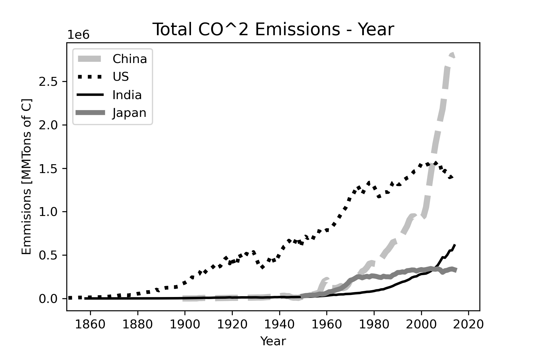
Exercises
1. True or False: Scientific visualization is the same thing as computer graphics.
2. Scientific visualization is the process of selecting and combining _________ of data to help in discovering laws or in communicating results appropriately for a given audience.
3. Scientific visualizations can be classified using the following dimensions (or axes): (choose all that apply)
- content
- dimensionality (2D/3D)
- time
- color
4. Classify the following visualization using the system in Figure 1.
5. Classify the following visualization using the system in Figure 1.
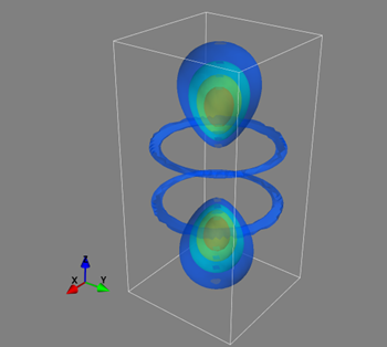
6. Classify the following visualization using the system in Figure 1. This visualization shows the hydrogen electron wave function for the n=4, l=3, m=0 state.
Program Modification Problems
1. The code shown below creates a histogram of the petal length measurements in the Iris Flower Data Set similar to Figure 13, except that bars have been colored according to species. You need to modify this code so that
It will create a histogram for the sepal length in the data set.
The x-axis label says “Sepal Length [cm]”
"""
Title: Iris Histogram
Author: C.D. Wentworth
Version: 7.31.2022.1
Summary: This program will read in the Iris data set and
         produce a histogram of one of the measurements.
Revision History:
    7.31.2022.1: base

"""

import numpy as np
import matplotlib.pyplot as plt
import pandas as pd
import seaborn as sns

# Import data as pandas dataframe
df = pd.read_csv('Iris.csv')

# Create a histogram - Seaborn version
sns.histplot(df, x='PetalLengthCm', bins=18, hue='Species')
plt.savefig('petalLengthHist.png', dpi=300)
plt.show()
2. The code below plots three exponential functions on the same graph. You need to modify the code so that it does the following:
- plots the following three functions on the same graph:
\(f_1\left(x\right) = x \quad,\quad f_2\left(x\right) = x^2 \quad, \quad f_3\left(x\right) = x^3\)
plot the functions over the range \(0.1 \leq x \leq 10\)
Change the legend to indicate the power involved in each function:
p = 1 , p = 2 , p = 3
- Make both the x-axis scale and the y-axis scale logarithmic.
"""
Title: Plotting Multiple Functions
Author: C.D. Wentworth
Version: 8.4.2022.1
Summary: This program will plot several functions on one graph
         using matplotlib.
Revision History:
        8.4.2022.1: base

"""
import matplotlib.pylab as plt
import numpy as np
x = np.linspace(0,5,40)
y1 = 0.10*np.exp(0.10*x)
y2 = 0.10*np.exp(0.20*x)
y3 = 0.10*np.exp(0.30*x)
plt.plot(x,y1,color='k',label='mu = 0.1',linestyle='solid', linewidth=3)
plt.plot(x,y2,color='b',label='mu = 0.2',linestyle='dashdot', linewidth=3)
plt.plot(x,y3,color='r',label='mu = 0.3',linestyle='dotted', linewidth=3)
plt.xlabel('x', fontsize=14)
plt.ylabel('y', fontsize=14)
plt.legend(loc='upper left')
plt.tight_layout()
plt.savefig('Ch5ProgModProb2.png', dpi=300)
plt.show()
3. The code shown below creates a scatterplot using the planets data. It uses the Seaborn module, as discussed in section 5.3.3. You need to modify the code to do the following
- Use data for bacterial growth in the file BacterialGrowthData.txt. This data gives the measured bacterial cell density in the growth bottle filled with either CHSA or TSB media (liquid food) as a function of time. To read this data into a Pandas dataframe you will need to tell read_csv that the file is tab-delimited instead of comma-delimited. This is done with sep keyward argument:
sep=‘\t’
You will also need to inspect the data file to determine which row is the header that contains the column headings. Remember that Python uses zero-based indexing.
Create a scatterplot of the CHSA column versus time.
Use the whitegrid Seaborn style.
Set the x-axis label to ‘t [min]’
Set the y-axis label to ’ N [rel]’. The N stands for the density of bacteria in the sample. The units [rel] indicate relative units.
Add a title: ‘Bacterial Growth versus Time: CHSA Media’ ; set the font size to 14.
Save the graph as a png graphics file.
"""
Title: Scatter Plot - Seaborn Version
Author: C.D. Wentworth
Version: 8.4.2022.1
Summary: This program will plot several functions on one graph
         using matplotlib.
Revision History:
        8.4.2022.1: base

"""
import matplotlib.pyplot as plt
import numpy as np
import pandas as pd
import seaborn as sns
sns.set_style('darkgrid')

# Read in exoplanet data as a pandas dataframe
planets = pd.read_csv('PSCompPars_subset.csv', sep=',', header=16)

# Create a scatterplot
sns.lmplot(x='pl_orbsmax', y='pl_orbper', data=planets,  fit_reg=False)
plt.xlim(0,1.2)
plt.xlabel('Orbital Semi-major Axis [au]')
plt.ylabel('Orbital Period [days]')
plt.savefig('pl_orbsmax-pl_orbper.png', dpi=300)
plt.show()
Program Development Problems
1. Develop visualizations that will help explore how per capita fossil fuel CO2 emissions have developed over time and how they compare by country in recent years. You can use the data in the csv file
fossil-fuel-co2-emissions-by-nation.csv
Go through the visualization development workflow discussed in Creating a Good Visualization. In addition to the code file or Jupyter notebook that you create, you need to write a brief summary of how you executed each workflow step (excluding the addition of interaction).
References
Atkinson, J. (2017, April 10). What is Earth’s Energy Budget? Five Questions with a Guy Who Knows [Text]. NASA. http://www.nasa.gov/feature/langley/what-is-earth-s-energy-budget-five-questions-with-a-guy-who-knows
Ausoni, C. O., Frey, P., & Tierny, J. (2014). Scientific Visualization at the interfaces. https://www.ljll.math.upmc.fr/frey/visu.html
Boden, T. A., Andres, R. J., & Marland, G. (2013). Global, Regional, and National Fossil-Fuel CO2 Emissions (1751—2010) (V. 2013). Environmental System Science Data Infrastructure for a Virtual Ecosystem (ESS-DIVE) (United States); Carbon Dioxide Information Analysis Center (CDIAC), Oak Ridge National Laboratory (ORNL), Oak Ridge, TN (United States). https://doi.org/10.3334/CDIAC/00001_V2013
Fisher, R. A. (1936). The Use of Multiple Measurements in Taxonomic Problems. Annals of Eugenics, 7(2), 179–188. https://doi.org/10.1111/j.1469-1809.1936.tb02137.x
Fry, Ben. (2008). Visualizing data. O’Reilly Media, Inc.; WorldCat.org. https://www.loc.gov/catdir/toc/fy0804/2008297507.html
Iris Species. (n.d.). Retrieved July 31, 2022, from https://www.kaggle.com/datasets/uciml/iris
List of named colors—Matplotlib 3.5.2 documentation. (2022). https://matplotlib.org/stable/gallery/color/named_colors.html
NASA Exoplanet Archive. (n.d.). Retrieved August 2, 2022, from https://exoplanetarchive.ipac.caltech.edu/index.html
pandas.read_csv—Pandas 1.4.3 documentation. (n.d.). Retrieved August 1, 2022, from https://pandas.pydata.org/docs/reference/api/pandas.read_csv.html
Power Project Team. (n.d.). NASA POWER Prediction Of Worldwide Energy Resources. Retrieved July 30, 2022, from https://power.larc.nasa.gov/
Rathod, V. (2020). Iris Flower CaseStudy. RPubs. https://rpubs.com/vidhividhi/irisdataeda
Shinker, J. J. (2016). Global Climate Animations. Gobal Climate Animations. http://climvis.org/content/global.htm
Shneiderman, B. (2003). The Eyes Have It: A Task by Data Type Taxonomy for Information Visualizations. In B. B. Bederson & B. Shneiderman (Eds.), The Craft of Information Visualization (pp. 364–371). Morgan Kaufmann. https://doi.org/10.1016/B978-155860915-0/50046-9
The pandas development team. (2022). pandas—Python Data Analysis Library. https://pandas.pydata.org/
Tory, M., & Moller, T. (2004). Rethinking Visualization: A High-Level Taxonomy. IEEE Symposium on Information Visualization, 151–158. https://doi.org/10.1109/INFVIS.2004.59